Table of contents
In the dynamic world of mobile applications, standing out requires a combination of groundbreaking features, slick interfaces, and – crucially, though often overlooked – consistent branding. While innovative features and excellent UX are fundamental, it’s your brand’s consistency that acts as an equally powerful force, transforming casual users into loyal advocates, forging a deep sense of trust and an emotional connection with your product.
Think about your favorite apps; the ones you return to day after day. What makes them stick? Often, it’s not just their utility, but the cohesive experience they offer, from the moment you first download them to every interaction thereafter. This isn’t accidental. It’s the result of strategic mobile app branding that permeates every aspect of the user journey.
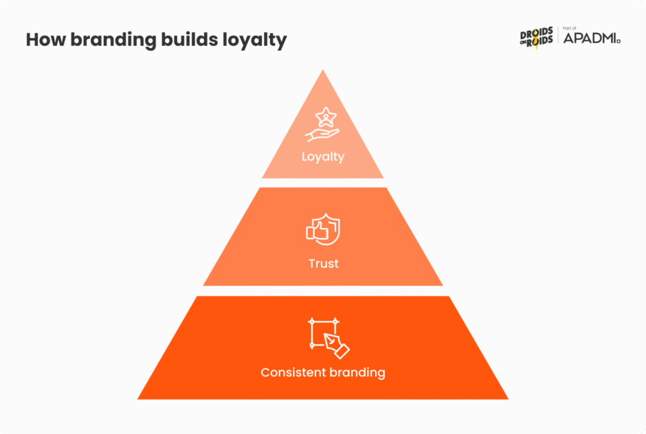
In this comprehensive guide, we’ll dive deep into how consistent branding acts as the bedrock for mobile app loyalty in 2025. We’ll explore the key levers that contribute to this powerful consistency: from establishing a compelling visual identity that resonates instantly, to crafting a distinct tone of voice that speaks directly to your audience, and ensuring seamless user flow consistency that builds confidence and predictability. Ultimately, we’ll show you how to leverage these strategies to not just capture attention, but to cultivate genuine user trust and unwavering loyalty.
Why consistency is the foundation of mobile brand loyalty
Consistency in mobile app branding isn’t merely about aesthetic appeal; it’s deeply rooted in human psychology. When users encounter consistent design elements, messaging, and interaction patterns within an app, it fosters a sense of familiarity and predictability. This familiarity, in turn, builds trust. Think about it: a consistent experience reduces cognitive load. Users don’t have to relearn how to navigate or interpret information with every new screen or update. This predictability makes the app feel reliable and dependable.
Over time, this repeated, positive, and predictable interaction strengthens the user’s connection to the brand. It’s similar to how we build trust in people we interact with regularly and consistently – their reliability makes us feel secure. For a mobile app, this translates into users feeling more confident and comfortable engaging with the product, leading to increased usage and deeper engagement.
Consistent branding isn’t just a “nice-to-have” as it does generate a measurable impact on business outcomes. It reinforces your brand identity, making it more memorable and recognizable in a crowded market. When users can instantly recognize and rely on your app’s brand, it lays a strong foundation for long-term loyalty and sustained growth.
Crafting a memorable look: Visual strategies for mobile app branding
A mobile app’s visual identity is its first impression and a continuous reinforcement of its personality. Beyond just a logo, effective mobile app branding relies on a cohesive and scalable visual system that communicates your brand values at a glance. It’s focuses on creating an intuitive and aesthetically pleasing environment that users instantly recognize and feel comfortable navigating. In 2025, simply having an attractive app isn’t enough; you need a visual strategy that builds recognition, fosters trust, and contributes to long-term user retention.

The power of a unified visual language: Icons, typography, and color
Imagine opening an app and encountering a jumble of inconsistent icons, jarring font changes, or a chaotic color palette. It would immediately feel unprofessional and untrustworthy. A unified visual language is fundamental to strong mobile app branding. This requires carefully selecting an icon style that reflects your brand’s character – whether sleek and modern, playful, or elegant – and applying it consistently throughout the app.
Similarly, typography isn’t just about readability; it conveys mood and professionalism. Choosing a primary and secondary typeface, and then sticking to their usage guidelines, ensures visual harmony.
Lastly, your color palette should be intentional. Beyond your brand’s core colors, consider how accent colors are used for calls to action or to denote status, ensuring they align with your brand’s overall emotional tone. This deliberate consistency across all these elements forms an intuitive visual shorthand for your brand.
Motion and microinteractions: Bringing your brand to life
In the static world of traditional branding, motion was often an afterthought. In mobile apps, however, subtle animations and microinteractions are powerful tools for reinforcing brand identity and enhancing the user experience. Think about the satisfying “ding” of a completed task, the fluid transition between screens, or a playful loading animation. These aren’t just aesthetic flourishes; they provide immediate feedback, guide the user, and inject personality into the app.

The consistent application of these elements – such as a signature loading animation, a specific haptic feedback pattern for confirmation, or a unique swipe gesture – can make an app feel alive and uniquely your brand. When done well, they contribute to a delightful and memorable user experience, turning functional interactions into moments of brand reinforcement.
Building for scale: The importance of a design system
As a mobile app grows, so does the complexity of maintaining visual consistency across new features, updates, and even different platforms. This is where a robust design system becomes indispensable. A design system is more than just a style guide; it’s a comprehensive library of reusable UI components, visual guidelines, and design patterns, all documented and accessible to your entire team. From buttons and input fields to navigation elements and typography rules, standardizing these components ensures that every new screen or feature automatically inherits your brand’s visual identity.
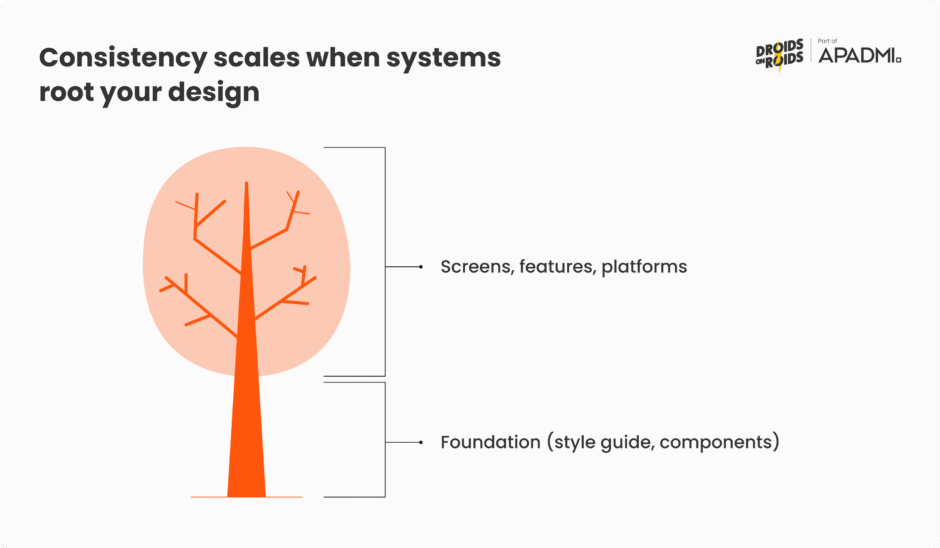
Based on my experience, implementing a design system from the outset dramatically reduces design and development time, minimizes inconsistencies, and ensures your mobile app branding remains cohesive and scalable, no matter how much your product evolves. It’s the infrastructure that guarantees your visual brand remains strong and unified over time.
Tone of voice: Branding beyond the visual
While visual elements are undeniably crucial for immediate recognition, your mobile app’s brand identity extends far beyond what meets the eye. The words you use, from onboarding screens and error messages to push notifications and in-app support, collectively form your brand’s tone of voice. This isn’t just about grammar or vocabulary; it’s about the personality your app conveys through its copy and messaging. A consistent tone of voice creates a sense of continuity, building trust and fostering an emotional connection that purely visual elements alone cannot achieve.
Consider how different brands “speak” to their users. Some are playful and informal, using humor and emojis to connect. Others are direct and authoritative, prioritizing clarity and efficiency. Then there are those that are empathetic and supportive, especially in sectors like health or finance. When your app’s copy consistently reflects a chosen personality, it feels authentic and predictable to the user. This predictability, much like visual consistency, builds confidence and makes the user feel understood and valued.

A well-defined tone of voice guides every written interaction within your app. It ensures that, whether a user is completing a purchase, receiving a personalized offer, or troubleshooting an issue, the underlying “voice” of the brand remains the same. This seamless communication reinforces the brand’s unique character, enhancing user engagement and solidifying their loyalty over time. It transforms functional text into a vital part of the overall brand experience, making the app feel more human and relatable.]
UX and interaction consistency drives retention
Beyond striking visuals and a compelling tone, the predictability of your app’s user experience (UX) and interaction logic is a critical, yet often unseen, pillar of strong mobile app branding.
When users consistently encounter familiar patterns for navigation, button placement, feedback mechanisms, and overall app behavior, it significantly boosts usability. They don’t have to guess or learn new rules on every screen; the app simply works the way they expect it to. This seamlessness creates a friction-free environment, making daily interactions effortless and enjoyable.
This predictability directly reinforces brand trust. Think of it like a reliable friend; you trust them because their actions are consistent and you know what to expect. In an app, consistent interaction logic means that a ‘save’ button always looks and behaves the same, swiping left always performs a similar action, or confirmation messages appear in a predictable manner. This eliminates frustration and reduces the cognitive load on the user, leading to a smoother and more efficient experience.
Consider navigation, for instance. A health and beauty app that consistently places its main categories in a tab bar at the bottom of the screen, or an electronics retailer app where the shopping cart icon is always in the top right corner, creates immediate familiarity. Users instinctively know where to find what they’re looking for, reducing the learning curve and making every session more efficient.
Similarly, predictable input fields and forms are vital. If a user expects an auto-fill feature to behave consistently across all forms. Perhaps pre-populating delivery details after a first purchase or if error messages for incorrect inputs always appear in the same visual style and location, it builds confidence in the app’s reliability. This consistency is crucial; it prevents small moments of confusion from accumulating into user frustration and eventual abandonment.

Ultimately, consistent UX and interaction design are powerful drivers of retention. Users are less likely to abandon an app that feels comfortable and familiar. All of this leads to an environment where the brand’s promise of ease and reliability is consistently delivered through every tap, swipe, and input. This deepens user satisfaction, reduces churn, and transforms mere usage into genuine loyalty, reinforcing your brand’s reputation as a reliable and user-centric solution.
Branding that builds habits and loyalty
The ultimate goal of consistent mobile app branding is to weave your product into the fabric of users’ daily lives, transforming occasional use into ingrained habits. When an app consistently delivers a predictable, positive, and on-brand experience – whether through its visuals, tone of voice, or intuitive UX – it reduces friction and builds a sense of comfort and reliability. This emotional and functional consistency makes the app the natural, go-to choice for specific needs or moments throughout the day.
Habit formation in the digital realm is often driven by a cycle of trigger, action, reward, and investment. Consistent branding plays a vital role in each of these stages. A recognizable app icon (visual branding) acts as a visual trigger. The consistent UX enables effortless action, leading to a predictable and often delightful reward (e.g., seamless task completion, personalized content, or a smooth checkout). Over time, this repeated positive cycle, reinforced by a familiar brand presence, encourages users to “invest” more of their time and data into the app.
Consider a fitness app where consistent motivational messaging (tone of voice), clear progress visualizations (visuals), and predictable workout tracking (UX) encourage daily check-ins. Or a retail app that consistently offers personalized recommendations and a familiar, frictionless purchase path, making it the default choice for shopping needs. When a brand’s identity is consistently reinforced across every touchpoint, it strengthens these habit loops. This leads to not just repeat usage, but a deeper sense of loyalty where the brand becomes an almost indispensable part of the user’s routine, ensuring sustained long-term retention.

Pitfalls to avoid: When consistency breaks
While the benefits of consistent mobile app branding are clear, the repercussions of its absence can be severe, leading to user frustration, eroded trust, and ultimately, app abandonment. Inconsistent branding isn’t just a minor oversight; it’s a fundamental breakdown that undermines the entire user experience infrastructure you’ve worked to build. When branding isn’t cohesive, it creates mental hurdles for users, and your app feels unpredictable and unreliable.
Inconsistent UI elements across screens or updates
One of the most immediate and frustrating pitfalls for users is when interface elements lack consistency. Imagine a button that’s green and says “Proceed” on one screen, but then changes to blue and says “Continue” on the next, or worse, has a different shape or size.
This extends to icons that vary in style or placement, or navigation menus that jump around. These seemingly small discrepancies force users to constantly re-evaluate what they’re seeing and how to interact with it, increasing cognitive load and slowing down their journey. For users of a health and beauty app, finding the ‘add to cart’ button in a different spot for every product, or a different icon for ‘favorites,’ quickly becomes annoying. Similarly, in an electronics retail app, if the filter options are presented differently on every category page, it creates unnecessary friction. Such inconsistencies break the intuitive flow users expect, leading to confusion and a diminished sense of professionalism.
Brand personality chaos: When your identity is disjointed
Beyond simple messaging shifts, a deeper pitfall arises when your brand’s core personality becomes chaotic due to contradictory promises or experiences. For instance, an app might heavily promote itself as “lightning-fast” and “seamless” in its marketing and initial onboarding, promising ultimate efficiency. However, if users then encounter consistently slow load times, convoluted multi-step processes for simple tasks, or frequent crashes, this directly contradicts the brand’s self-proclaimed values.
This dissonance creates a jarring and untrustworthy experience. Users quickly perceive that the brand isn’t living up to its own hype, leading to a profound sense of disappointment and a breakdown of credibility. This type of inconsistency doesn’t just confuse; it actively undermines the very essence of what your brand claims to be.
Broken user flows or illogical interactions
Beyond static elements, inconsistencies in interactive behavior can be profoundly damaging. This pitfall occurs when users expect a certain outcome from an action based on their past experiences within the app or common mobile patterns, but the app behaves illogically.
For example, if swiping left usually deletes an item, but suddenly in a new section, it archives it without clear indication. Or, if a form’s validation process changes mid-way through, or auto-fill behaves differently based on minor variations in context. These unpredictable interactions can be incredibly frustrating. They force users to stop, think, and often make mistakes, leading to a sense of incompetence or irritation. When an app doesn’t behave predictably, it erodes the user’s confidence in the product and, by extension, the brand, making them less likely to return.
Top examples of effective mobile app branding in 2025
Learning from the best is always a powerful strategy. When we look at leading brands that excel in mobile app branding, it’s clear that their success stems from a relentless commitment to consistency across every user touchpoint. These companies understand that their app is not just a tool, but a direct extension of their brand promise. They weave their core identity – be it innovation, transparency, or premium experience – into every visual, interaction, and message within their mobile platforms.
Apple: The epitome of ecosystem consistency
Apple’s mobile apps are a masterclass in extending its powerful brand into the digital realm. From the minimalist visual design to the intuitive user experience, every Apple app consistently reflects the brand’s core values of simplicity, elegance, and premium functionality.
Whether it’s the seamless experience of the Apple Store app, the unified aesthetic of Apple Music, or the predictable layout of Apple Wallet, users immediately recognize and trust the “Apple way”. This deep-seated consistency across its entire software ecosystem reinforces user confidence, making interactions feel natural and expected, directly contributing to the brand’s immense loyalty.
The Ordinary: Branding through radical transparency and education
In the crowded health and beauty sector, The Ordinary stands out by building its mobile app branding around radical transparency and scientific education. Their app’s visual design is clean and utilitarian, prioritizing clear product information over flashy visuals. The tone of voice is direct, factual, and informative, avoiding marketing jargon.

This consistent approach – from detailed ingredient lists to straightforward usage instructions – creates a trustworthy and no-nonsense brand experience. For users seeking clarity and efficacy, The Ordinary’s app consistently delivers on its brand promise, fostering a loyal community that values authenticity and knowledge above all else.
Dyson: Premium innovation reflected in intuitive app control
Dyson extends its brand identity of high-end, innovative engineering directly into its mobile app experience. Their apps, primarily used for controlling smart home devices like air purifiers or robot vacuums, showcase a consistent visual language that is as clean, modern, and precise as their physical products.

The user interface is designed for intuitive control, reflecting Dyson’s commitment to sophisticated functionality and ease of use. From seamless device pairing to real-time performance monitoring, the app’s consistent design and predictable interactions reinforce the brand’s premium status and commitment to cutting-edge technology, ensuring the digital experience aligns perfectly with the physical product’s promise.
Ulta Beauty: Personalized journeys in the world of beauty
Ulta Beauty’s mobile app is a prime example of effective branding through personalized, omnichannel experiences in the health and beauty space. The app consistently reinforces Ulta’s brand promise of diverse product selection and tailored advice. Through personalized recommendations, virtual try-on features, and seamless integration with their Ultra Beauty Rewards loyalty program, the app creates a highly relevant and engaging journey for each user.
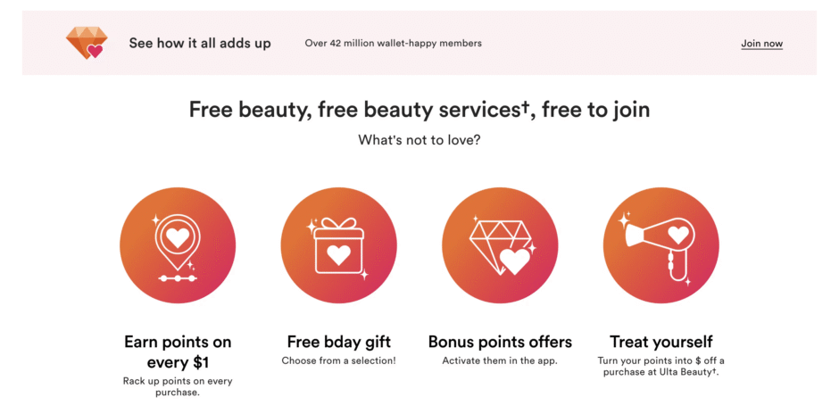
The visuals are vibrant and inviting, mirroring the in-store experience, while the messaging is helpful and encouraging. This consistent focus on personalization and convenience through a well-designed app strengthens user engagement and fosters deep loyalty among beauty enthusiasts.
Sephora: Personalized omnichannel beauty at scale
Sephora’s mobile app is a textbook case of consistency-powered branding, weaving its digital features directly into the in-store and online experience. The sleek visual design – rich photography, streamlined navigation, and balanced use of brand colors – mirrors Sephora’s brick-and-mortar identity.
Advanced tools like the Virtual Artist augmented‑reality try‑on and AI‑driven product recommendations deliver a unified tone of empowerment, beauty-first personalization, and loyalty integration from the Beauty Insider program. This seamless integration across app, site, and store elevates customer satisfaction, deepens trust, and creates consistent brand reinforcement across every touchpoint.
Rituals: Translating self-care philosophy into a brand-consistent mobile experience
Rituals’ mobile app captures the brand’s essence of turning daily routines into meaningful moments through a deeply calming and visually cohesive experience. Soft animations, a gentle color palette, and curated wellness journeys mirror the aesthetic found in-store and in Rituals’ broader marketing.
The tone is nurturing and reflective, reinforcing the brand’s emphasis on balance and intentionality. Every screen, from onboarding to personalized ritual recommendations, maintains this consistent emotional presence, transforming the app into a digital sanctuary that aligns seamlessly with the physical brand world.
Samsung: Cohesive ecosystem branding across devices and digital touchpoints
Samsung’s suite of apps – SmartThings, Samsung Health, home appliance controls, and more – reflects a unified visual and interaction language that mirrors its hardware design system. Clean layouts, consistent iconography, and typography echo the broader Samsung aesthetic.
Microinteractions, navigational cues, and motion transitions follow One UI principles, making each interaction feel familiar and intuitive, whether you’re on a Galaxy phone or SmartThings controlling a fridge. The tone remains helpful and professional, positioning Samsung as a trusted innovator. This tightly aligned experience across mobile, smart home, and device control reinforces brand promise and deepens user engagement across all touchpoints.
Philips Hue: A lighting app that speaks the brand’s language
The Philips Hue app is a standout in how it fuses smart technology with effortless UX. It offers a dark‑mode-compatible interface accented with vibrant hues that reflect user-controlled lighting scenes. With intuitive sliders, real‑time previews, and automation setup, users are encouraged to experiment seamlessly, lowering barriers to entry while reinforcing the brand’s ethos of human-centered innovation.
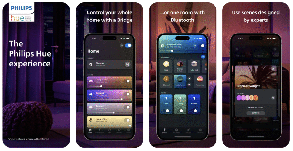
Subtle haptic feedback and smooth transitions across device and scene flows ensure every interaction feels polished and predictable. With every update – from its well-recognized 3.0 redesign to AR-based preview tools – the app consistently evolves without straying from core design principles. This level of cohesion deepens trust and affirms Hue’s identity as an accessible yet cutting-edge smart lighting solution.
Conclusion: Make consistency your branding superpower
In the competitive mobile app landscape of 2025, branding is far more than just a logo or a marketing campaign; it’s the fundamental infrastructure of your user experience. As we’ve explored, a cohesive brand presence across visuals, tone of voice, and user interactions isn’t merely about aesthetics – it’s about building genuine user trust and forging lasting emotional connections.
Think of your brand consistency as the bedrock upon which user habits are formed and loyalty is built. When your app consistently delivers a predictable, reliable, and on-brand experience, it eliminates friction, fosters familiarity, and reinforces confidence. This continuous reinforcement transforms casual engagement into daily rituals, making your app an indispensable part of your users’ lives.
Ultimately, the equation is simple yet powerful: Consistency equals Trust, Trust equals Retention, and Retention equals Loyalty. By prioritizing consistent mobile app branding, you’re not just investing in marketing; you’re investing in a robust user experience that drives sustained growth and ensures your brand remains top-of-mind for years to come. Make consistency your branding superpower, and watch your user base transform into a loyal community.

