Motion design is one of the most double-edged tools in a designer’s toolkit. If you do it the nice way, it can make the screen look better, help people know where to look, make the important stuff stand out, and even make moments that people will think about later. When executed poorly, it can distract, frustrate, and even push away the very audience you aim to engage.

I learned this the hard way when I used a parallax scroll effect that dazzled in prototypes but caused headaches in real use. It was not that the technique was bad in theory, as I was more interested in the fancy movements; it was that I deployed it without fully considering performance, accessibility, and context.
In this article, I’ll explore why motion design continues to hold a lasting place in the design world. I’ll also pick out some common pitfalls that trip up even experienced designers, detail out a real case study from my own work and what I learned from it, and share some practical best practices to make your motion design both engaging and user-friendly.
By the end, you will know how to keep motion as an asset, not a liability.
Why motion design will never die in digital products
Motion has been something people use to talk to each other for a very long time, even before we had screens, phones, or computers. People waved their hands, made faces, and told stories with pictures that seemed to move in our heads. Our brains are made to see things that move, and moving things pull our eyes way faster than just pictures that stay still.
- It grabs attention and directs focus — From highlighting a new feature to drawing the eye toward a call-to-action, motion works as a visual highlighter. Duolingo’s animated streak flames are not just fun; they anchor users’ focus and reinforce habit-building

- It supports storytelling — Brands like Apple use motion to immerse users in their world. Their Liquid Glass effects on iOS make interface transitions feel organic and almost tactile, which deepens the emotional connection to the product

- It reinforces brand personality — Playful microinteractions, such as loading screens with light-hearted messages or subtle animated icons, can reflect a product’s friendly, approachable tone
In short, motion taps into something primal. Without intention, it can overwhelm instead of enhance.
Motion design pitfalls
Even with its benefits, motion can easily turn against you. Here is where I have seen it and experienced it go wrong:
- Overly complex transitions — What feels elegant in concept can become a time-waster in practice. I once saw a dashboard where every widget slid into place with a one-second animation. It was charming at first, but frustrating when you were in a hurry
- Carousels and auto-advancing content — These force users to keep pace with the design instead of controlling their own flow. Users often miss key details or grow frustrated trying to pause or backtrack
- Performance bottlenecks — Heavy JavaScript animations or unoptimized GIFs can tank frame rates, especially on mid-range Android devices or slow connections. What feels silky on a powerful laptop may crawl elsewhere
- Accessibility oversights — Ignoring prefers-reduced-motion settings means you are forcing motion on users who may be sensitive to it. For some, this is not just irritating; it is physically uncomfortable or disorienting
- Style over substance — Motion should serve a purpose. A button that bounces for no reason may look fun, but it can come across as amateurish and distracting if it does not match the tone or function
Where misused motion may hurt users
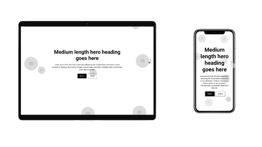
I was working on a project for a client launching a new online service. We wanted the homepage to feel dynamic and premium, so I proposed a parallax effect where the background and foreground moved at different speeds as you scrolled. In the design mockups, it was gorgeous. The imagery felt layered, almost cinematic:

The reality after testing with users
During usability testing, it became clear that the problems were mostly on mobile. Desktop users experienced the smooth, immersive effect I intended. But on phones, especially mid-range models, it was a different story:
- Mobile lag — On mid-range phones, scrolling stuttered noticeably
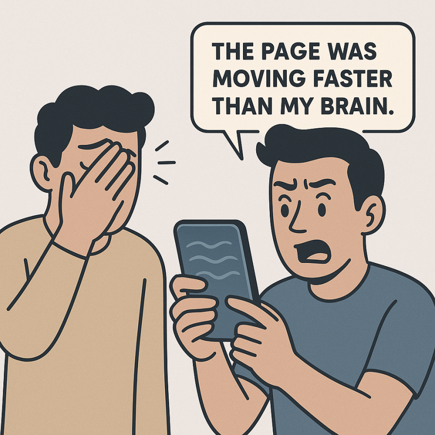
- User discomfort — In testing, one participant rubbed their eyes and asked if there was a way to “turn that off.” Another said it felt like “the page was moving faster than my brain”

- Message loss — The product’s core value proposition, the thing we wanted users to notice first, was literally sliding out of focus because the background stole the show
This was not a one-off problem. Studies back up these reactions. Parallax can cause motion sickness for a portion of users and often hurts perceived usability when overused.
How I fixed it
Since the main issues came from mobile users, I had two clear options:
- Remove parallax entirely from the mobile version
- Optimize it so it runs smoothly, which means compressing assets and working with developers on performance improvements
I ended up doing both. Why? Because the core issue was on mobile, desktop users had more screen real estate and stronger hardware, so the motion was less of a problem there. On mobile, I replaced most of the decorative parallax with fade-ins for headlines and gentle scale effects on key calls-to-action. These animations guided attention without slowing performance or causing discomfort:

The result — Testing after these changes showed fewer reports of discomfort, faster load times, and users noticing the main messaging more quickly.
Best practices for motion design
Here is a distilled checklist of what works and why:
- Start with purpose — Motion should have a job: guide attention, signal change, provide feedback. If it is just “because it looks cool,” reconsider
- Respect user preferences — Implement prefers-reduced-motion and consider manual toggles for animations over five seconds
- Keep it quick — For the majority of UI animations, a duration of 200–500ms strikes the perfect balance, noticeable without losing that quick, responsive feel
- Avoid motion-dependent essentials — Never make critical interactions rely entirely on animation cues. Provide static equivalents
- Test across devices — Always check motion on lower-end hardware. A smooth effect on your design laptop might stutter badly elsewhere
- Enhance clarity, not compete with content — Motion should make the interface easier to understand, not distract from the task
Conclusion
Motion design goes beyond simply making visuals attractive. It is about enhancing usability, communicating clearly, and reinforcing brand personality. “My parallax fail” taught me that motion without clear intent and careful execution can undermine all of those goals.
The takeaway? Treat motion as you would any other UX element. Test it, measure its impact, and be willing to dial it back if it is not serving the user. When it is done thoughtfully, motion does not just make a product feel alive; it makes it feel effortless.

